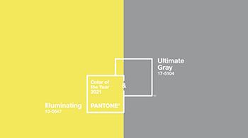
Thoughts On 2021 Pantone Color of the Year
This week the Pantone Color Institute™ selected as the Color of the Year two colors – a yellow and a gray. The yellow is reminiscent of sunflowers, yellow mums, daffodils, marigolds and many other flowers. The gray could be the container used, pebbles on a beach, or other hardgoods elements. But perhaps a more critical look at these two colors being selected as Pantone Color of the Year might be found in the story here by color consultant Kate Smith of Sensational Color.

As a further note, please be aware that even though the Pantone Color of the Year seems to get the most press, there are many other organizations that also pick their color of the year. Among these are the leading paint companies and, as Kate Smith points out in this second article, many other companies are sticking to neutrals, noting that these will be “safer” choices no matter the mood of the country, how the economy performs, or the tastes of most consumers.
As you are aware, pampas grass and a few other blooms of grasses aside, our horticultural palette does not offer many beiges, grays or other neutrals, but neutrals can serve as interesting foils for bold colors of almost any hue or even softer shades, such as pastels (e.g., think of pinks against a grey background).
With this information, I think you will be equipped to have conversations with customers, local media or anyone else who might be interested in talking about the Pantone Color of the Year. You may choose to stick to the particular Illuminating yellow and Ultimate Gray chosen by Pantone, prefer to move to a more neutral palette, or go down your own path and declare that any color that nature offers up should be quite acceptable for any consumer who selects their own color of the year.